

Offis
Timeline
3 weeks
Designer
Tanya Dennis
Roles
UX Researcher, UX/UI Designer, Analyst
Client
Offis Co-working space
Platform
Web
Date
July 2025

About the project
OFFIS is a contemporary co-working space in Berlin, thoughtfully designed for freelancers, creatives, and tech professionals in their 20s to 40s. It offers a unique blend of flexibility, focus, and community within a stylish, design-forward environment.
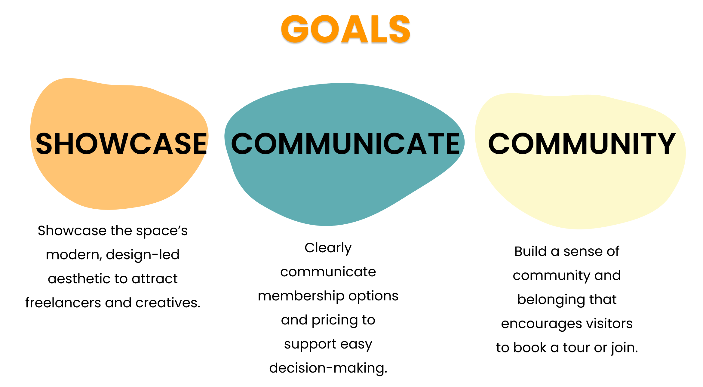
To connect with their target audience, the founders recognised the need for a strong digital presence. The website had to clearly communicate pricing details and membership options, while also serving as an inviting introduction to the space.
The key challenge was to design a site that not only highlights the aesthetic appeal of OFFIS but also functions as a clear and accessible resource for information about pricing, workspace options, and available amenities.

The Solution
I set out to create a website that captured the clean, contemporary feel of OFFIS while delivering a seamless, user-focused experience. My goal was to balance aesthetic appeal with clear functionality, ensuring that visitors could easily explore membership options, pricing, and amenities without feeling overwhelmed.
I built the site around a strong visual hierarchy and intuitive navigation, using whitespace and structured layouts to keep information clear and digestible. To reflect the brand’s design-forward identity, I paired a monochrome base with bold orange and yellow accents that bring warmth and energy to the interface. Subtle animations and consistent spacing create a sense of flow, mirroring the calm yet dynamic atmosphere of the physical space.
The final result is a website that not only showcases the aesthetic and community-driven nature of OFFIS but also helps potential members quickly understand what the space offers — encouraging them to take the next step and book a visit.
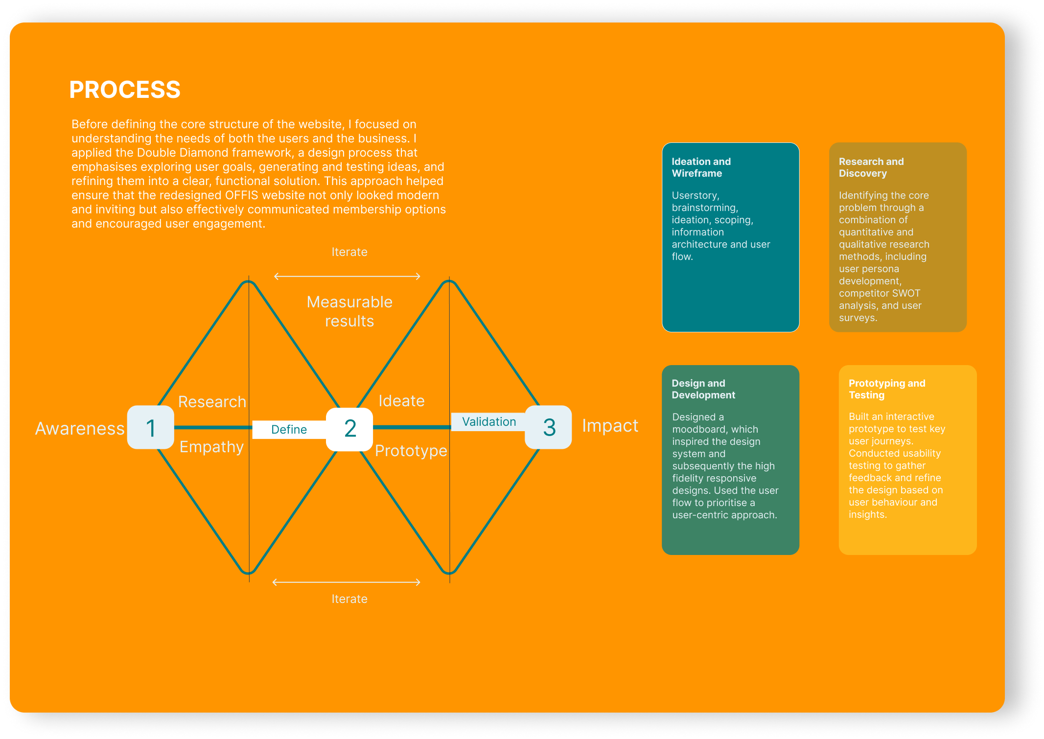
Process
This project followed the Double Diamond design process, which includes four key stages: Discover, Define, Develop, and Deliver.
This framework provided a clear structure for the redesign, from understanding user needs and identifying pain points to exploring creative solutions and refining the final design. It ensured that every decision was grounded in user experience while aligning with OFFIS’s brand vision and business goals.
I have outlined a brief overview of each phase to illustrate how the Double Diamond approach guided the redesign of the OFFIS website.
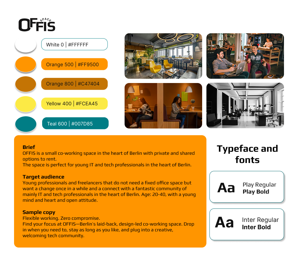
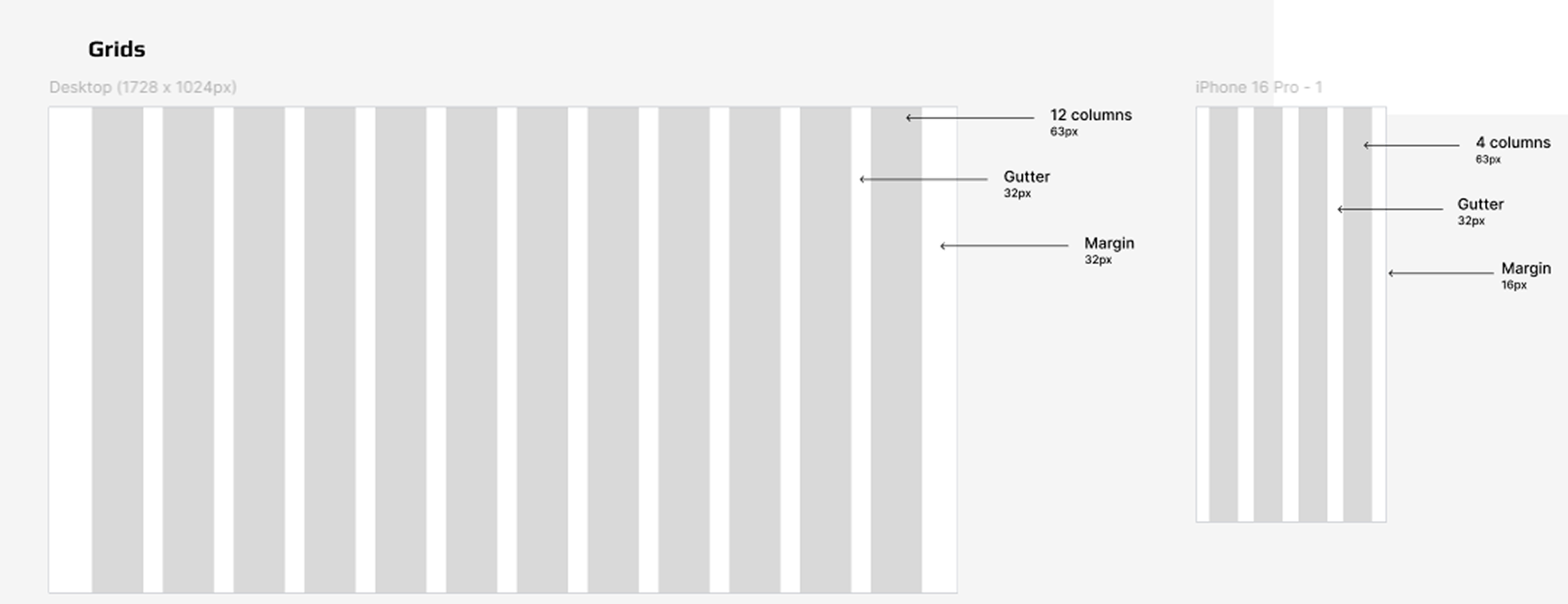
Design System
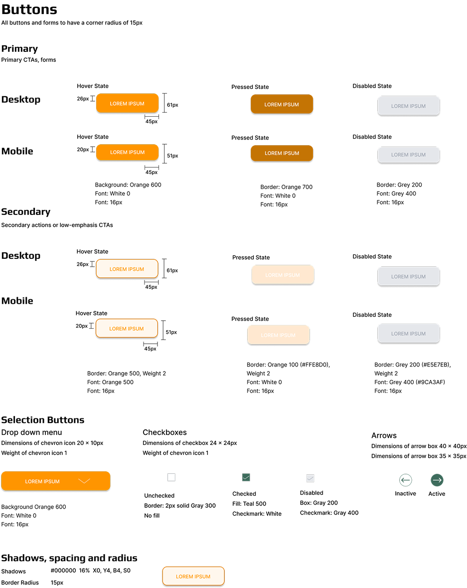
The design system was developed using both the wireframe and moodboard as foundational tools to ensure consistency, clarity, and cohesion across the OFFIS brand. It includes detailed guidelines for core design elements such as typography, colour palette, buttons, spacing, and layout. These components were chosen to reflect the brand’s modern, functional identity while supporting accessibility and responsive design. The system provides a clear visual language that can be applied across desktop and mobile, helping maintain a unified look and feel throughout the user journey.
UX Laws
Several UX laws were considered in designing the OFFIS wireframe to ensure a seamless and intuitive user experience. Hick’s Law informed the minimal and clear navigation, helping users make faster decisions by reducing cognitive load. Fitts’s Law guided the placement of key buttons such as “Book Now”, making them easy to locate and interact with across both desktop and mobile devices.
The Law of Proximity was applied in the pricing and features sections by grouping related content together, making it easier for users to scan and understand. Miller’s Law influenced the content layout, ensuring text was broken into digestible chunks to avoid overwhelming users.
Additionally, Jakob’s Law supported familiar design patterns, such as a sticky navigation bar and modular pricing cards, to meet user expectations and reduce the learning curve. Together, these principles create a user journey that feels logical, fast, and effortless.


Hierarchy
Given the volume of information on the OFFIS website, a clear content hierarchy was essential to guide users smoothly through their journey. Key calls-to-action, such as “Book Now,” are prominently placed in the navigation and hero section on both desktop and mobile to ensure immediate visibility.
The layout follows a logical flow, starting with the value proposition, followed by community insights, pricing, and features, which helps users understand the offer before taking action. Important information sits at the top of each page, while more specific or supporting content appears further down.
Visual hierarchy is reinforced through styled headings, subheadings, and body text, allowing users to scan and prioritise content with ease. Icons and modular pricing cards further break up text-heavy areas, improving readability.
Together, these elements support an intuitive, user-focused experience that balances information delivery with clear conversion paths.
Spacing
White space and alignment were used intentionally throughout the OFFIS wireframe to enhance readability, balance, and overall user experience. Generous white space separates sections clearly, allowing users to focus on one area at a time without feeling overwhelmed. This is especially important in content-rich sections like “Space Features” and “Prices,” where visual breathing room supports clarity and ease of navigation.
Consistent alignment reinforces visual order, guiding the eye naturally from one element to the next.
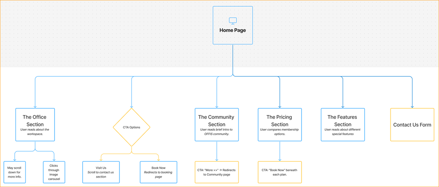
User Flow
The Information Architecture for OFFIS was carefully designed to create a smooth and intuitive user experience. I began by mapping out a user flow for the homepage to ensure clarity in navigation and purposeful content placement. The homepage guides users from headline messaging through key areas such as office features, pricing, community, and contact. Each section is structured to support scannability and clear user pathways, helping visitors find relevant information with ease and encouraging action through clear calls to action.
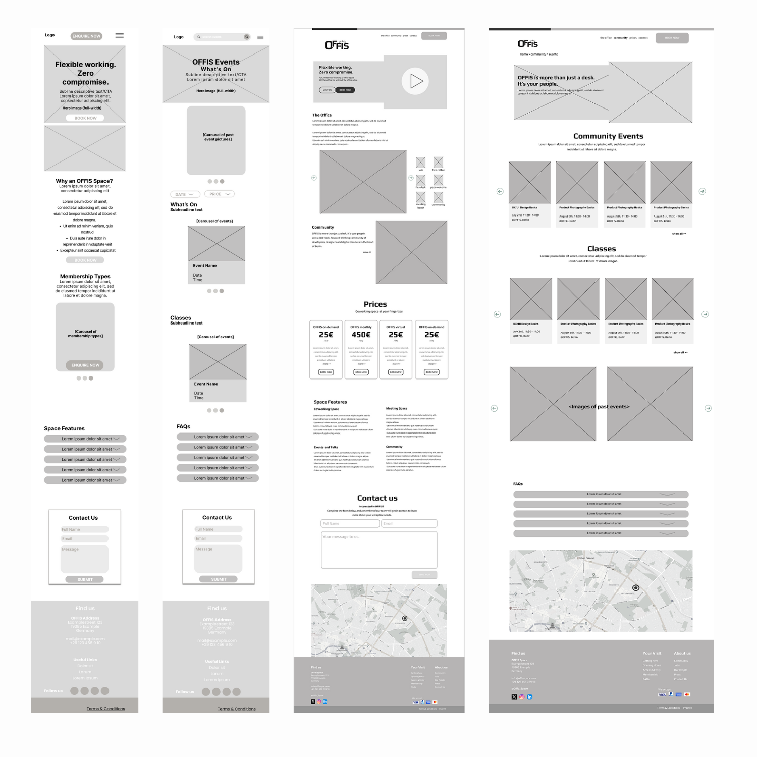
Wireframes
For the primary wireframes, I focused on two key pages: the homepage and the community events page. These pages were chosen to showcase both the site's landing experience and its interactive, community-driven features. The wireframes are mid-fidelity and have been developed for both mobile and desktop views, supporting a responsive design approach throughout the project.
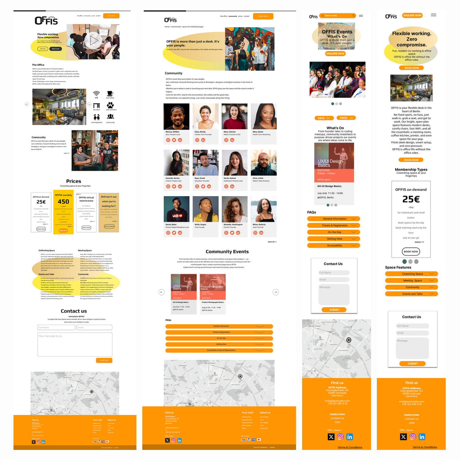
Screen Designs
My final screen design was developed using the foundation of the moodboard, wireframes, and design system. These elements worked together to guide visual consistency and ensure the design aligned with the intended brand identity. The layout incorporates the approved colour palette, consistent typography styles, and carefully chosen imagery that reflects the tone and purpose of the co-working space. Each section is designed with clarity and functionality in mind, resulting in a clean, modern interface that supports a seamless user experience across both mobile and desktop screens.
Both the desktop and mobile frames are designed to be responsive.
Reflection
Throughout this project, I gained valuable insight into the practical application of UX principles, design systems, and content hierarchy. Creating the user flow for the homepage allowed me to map out the user journey clearly and make intentional design choices that enhance usability. Using UX laws like Hick’s Law and Fitts’s Law helped me simplify navigation and prioritise key actions such as booking. The wireframing process also challenged me to think critically about white space, alignment, and responsive design for both desktop and mobile. Tools like the moodboard supported my visual direction and helped maintain a consistent look and feel across components.
Conclusion
This project reinforced the importance of thoughtful structure and user-centred design in web development. By integrating UX best practices with a strong visual hierarchy and a consistent design system, I created an intuitive, engaging, and functional experience. The process has not only improved my technical skills but also deepened my understanding of how design decisions impact real user behaviour.